BATL
01
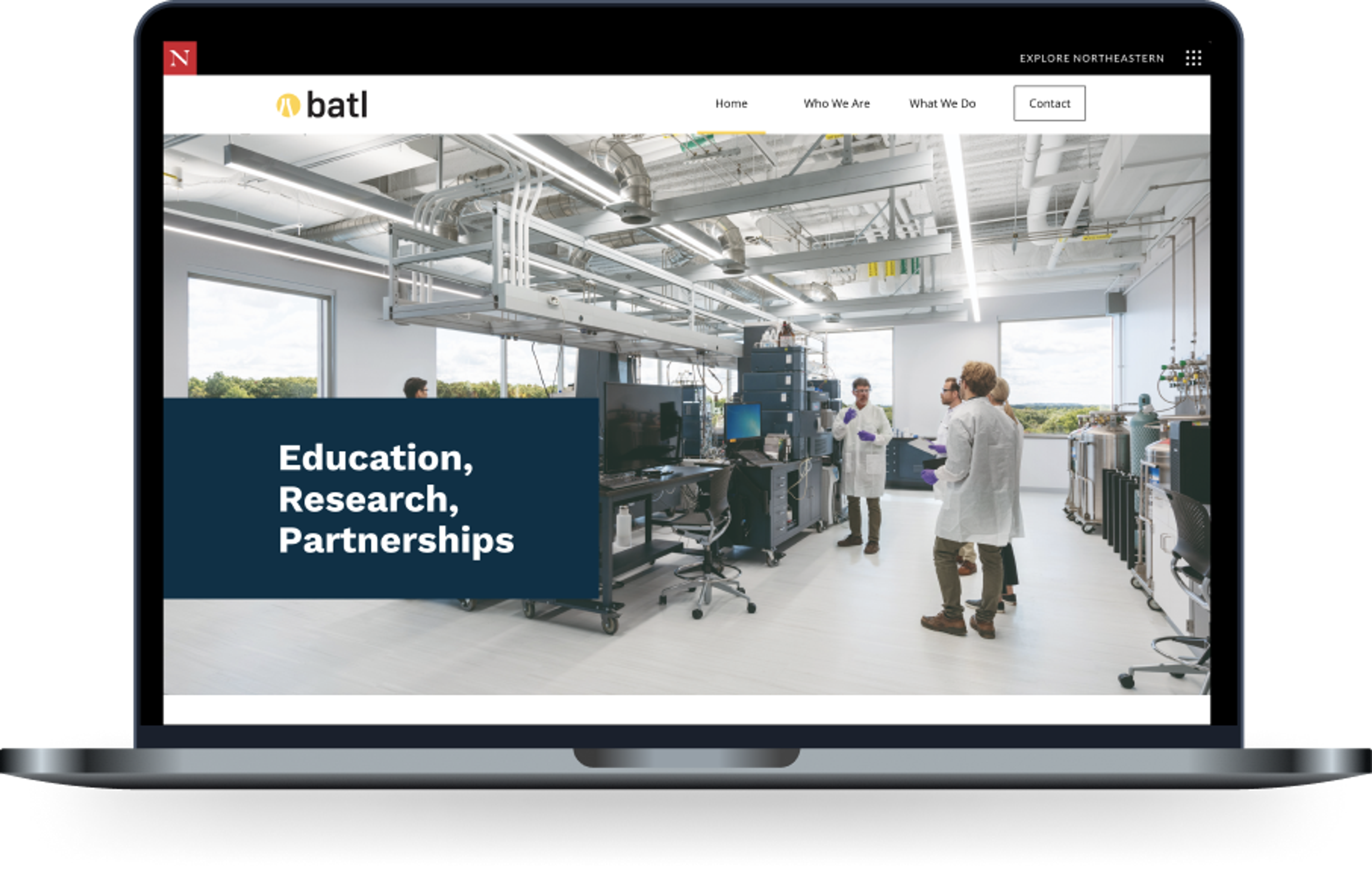
Brand identity development and custom site for a global research lab that offers experiential learning and credentialing programs to train the pharmaceutical industry's workforce.
Role
Lead developer
Team
Duration
4 Months

Overview
The Client
Partnered with Northeastern University, The Biopharmaceutical Analysis Training Laboratory, BATL, provides worldwide training, research, and education to industries including biopharma, government, and academia at their facilities based in the US and around the world. In 2020, BATL transformed part of its lab to house the University’s COVID-19 test center for students and faculty.
BATL was brought on as a client to Northeastern’s student-led design studio, Scout, to undergo a semester-long design uphaul – re-designing their entire brand identity and developing a new site.
The Problem
BATL is looking for a strong brand identity to solidify its place as a top regulatory global agency. This brand needs to amplify its voice and highlight the pillars of its mission. When people visit the site, they need to be able to understand three things:
- Who is BATL? What are their qualifications and why are they important?
- What BATL can do for them, training courses they offer.
- How to reach BATL and get involved.
Our Impact
The result included a brand that is exciting, bold, clean, and approachable — identified primarily by energetic typography, structured color blocks as well as vibrant circular and rectangular graphic elements. All of these combined result in a dynamic and fun approach to scientific innovation and experimentation.
BATL’s new site included multiple pages with comprehensive information on its mission, history, contact information for leadership, current courses, resources, and location. This new site provided a strong online presence with the necessary actions for prospective users to understand what BATL can do.
Diving Deeper
Discovery
Defining the User
Meeting with BATL's representative, Scout conducted a variety of collaborative brand exercises to define deliverable goals.
Target Audience
- Regulatory agencies around the world
- Under-skilled Industry members that BATL can train with their offered courses
- Academic institutions for collaboration
Key user stories
- As an employee of a health organization like WHO, I want to know what BATL could offer in a partnership by a section dedicated to that or a call-to-action to reach out
- As an undergraduate student, I want to browse bioanalytics courses I may be qualified for through a page dedicated to course descriptions and required skills.
- As a research professional, I want to see the results of BATL's collaborative research studies through links to previous and ongoing research.
- As a potential collaborator, I want to understand BATL's mission statement in simple terms through the home/landing page.
- As a biopharmaceutical professional, I want to be able to contact a BATL staff member by phone or email likely by clicking on a link that leads to a contacts page.
Competitor analysis
We looked at other global research brands to get an understanding of the language and style that is most common. We found that most sites included a large hero image, minimal design with clear navigation, bold type, and color-block sections.
Design process
Creating the brand
After getting an idea of the style of brands within this industry and completing brand exercises with our client, we started to mood board for the new brand.
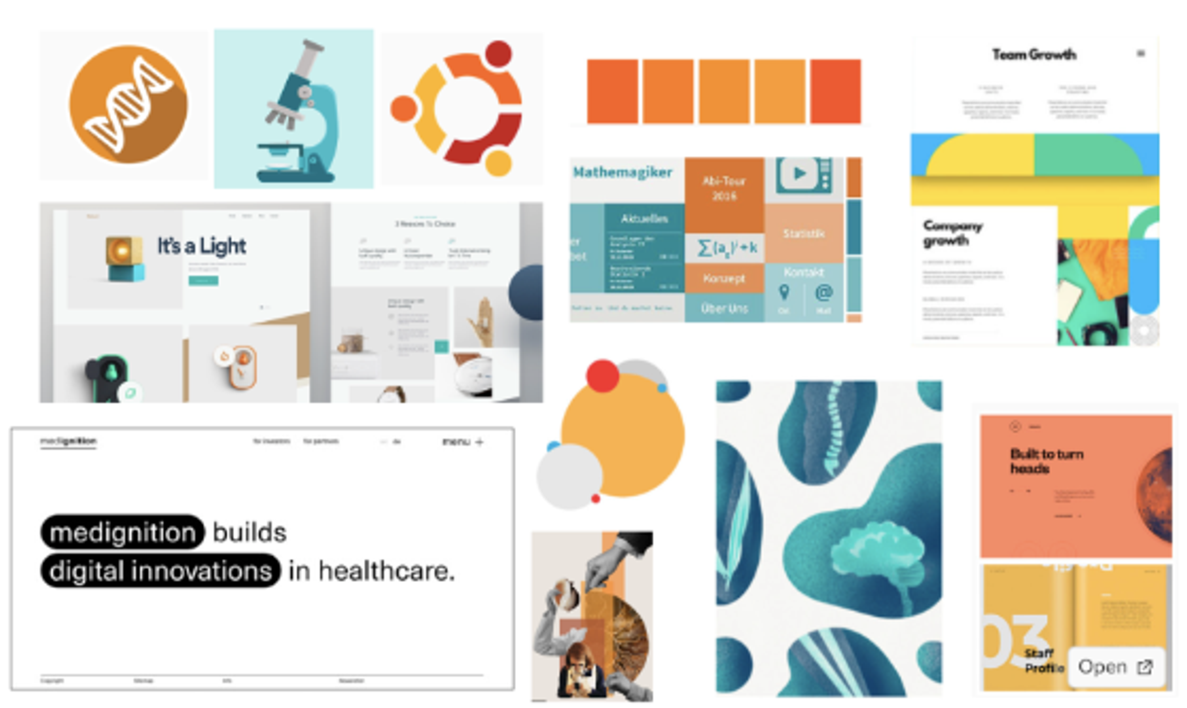
Initial brand direction
Our team started with 3 brand directions:
- Clean and informative
- Bold and vibrant
- Warm and approachable
Warm and approachable stands out against the typical branding of the competitors (sterile, cool tones, very geometric) and solidifies the message that BATL provides a unique offering and differs from traditional labs.
We landed on a playful mood, inviting but still sophisticated, looking to include:
- Geometric shapes, organic composition
- Illustrations
- Color blocking & text highlighting
Logo development
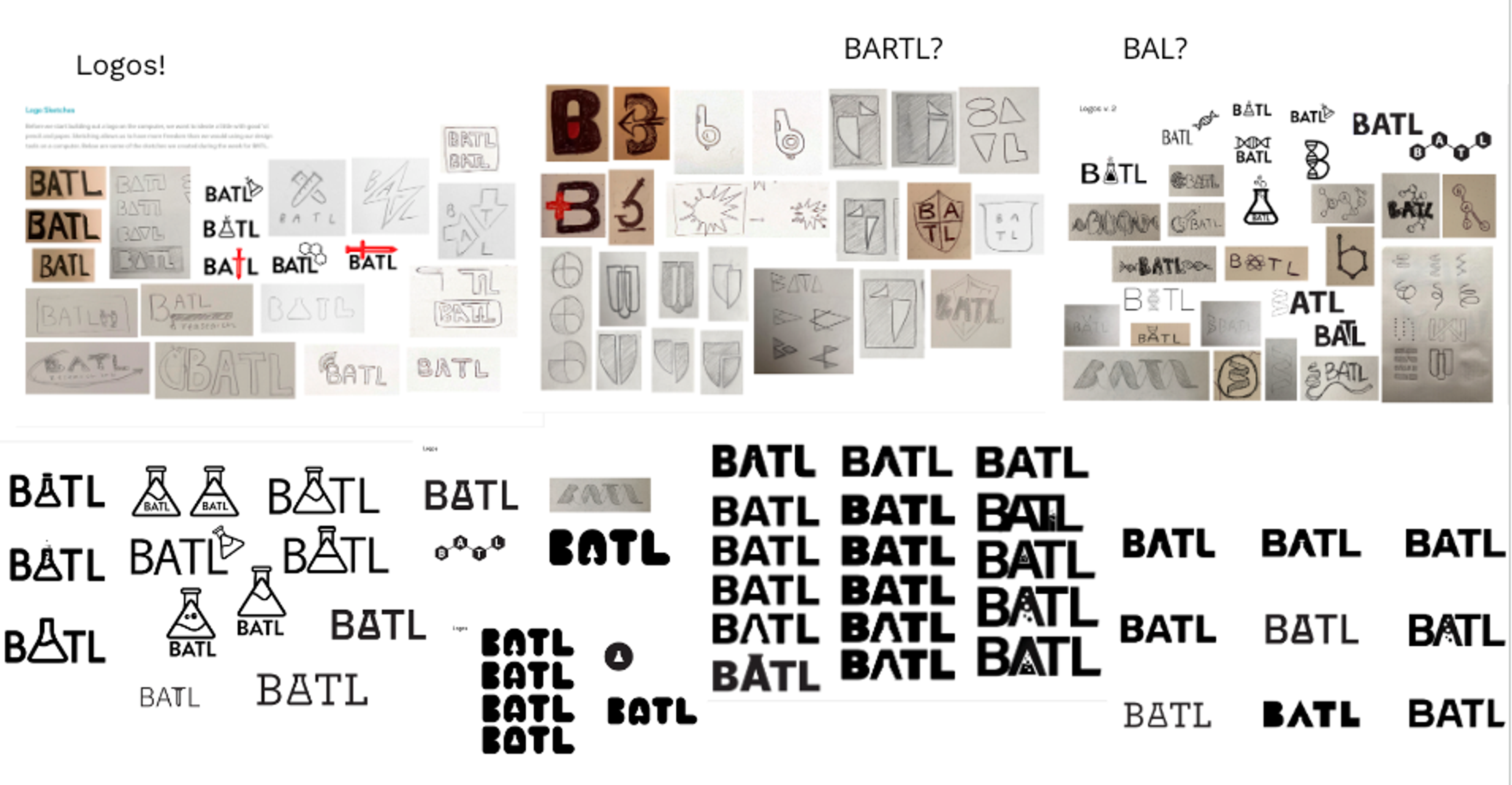
Creating the logo was a group process and we wanted to hone in on balancing between sophisticated, minimal yet creative.
Colors & brand elements
Developing a balanced palette was equally as important. While not wanting to stray too far from the industry’s common traits, we tried out an array of vibrant primary and secondary colors - yellow being our main focus. We chose this yellow to be strong, familiar, and bold. This color strays from the typical blue found in the healthcare industry but still conveys trust and confidence.
Our brand elements lean into the geometric style and serve as a way to add playfulness to the brand. The secondary colors will primarily be used here.


Wireframes
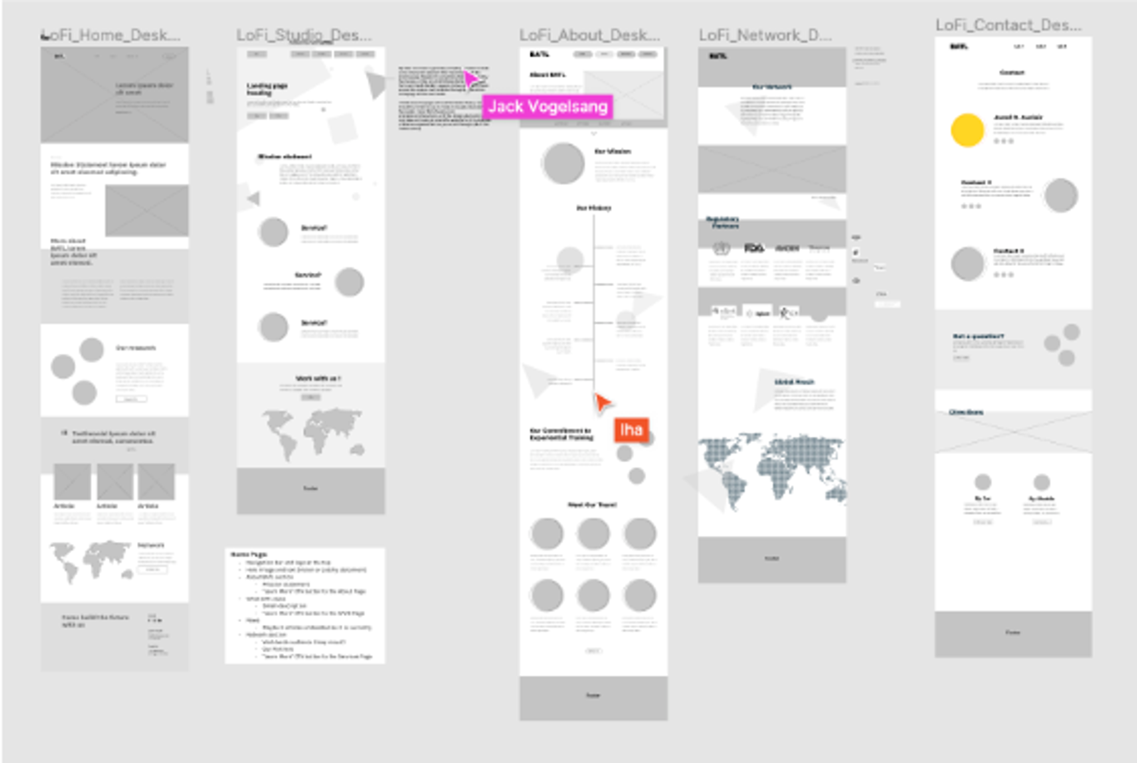
Developing wireframes helped lay out and envision all the content of BATL’s site. We grouped important information within color blocks, incorporated our brand elements, and made a content-heavy site feel dynamic and exciting. We want a user to be able to follow BATL’s story without getting lost in the site’s flow or technical jargon.
Development
Agile process
Developing BATL’s brand came with many iterations. In a span of 14 sprints and weekly client meetings, we took ideas to fruition and delivered a complete brand identity, branding guidelines, and a fully functional site.
Logo
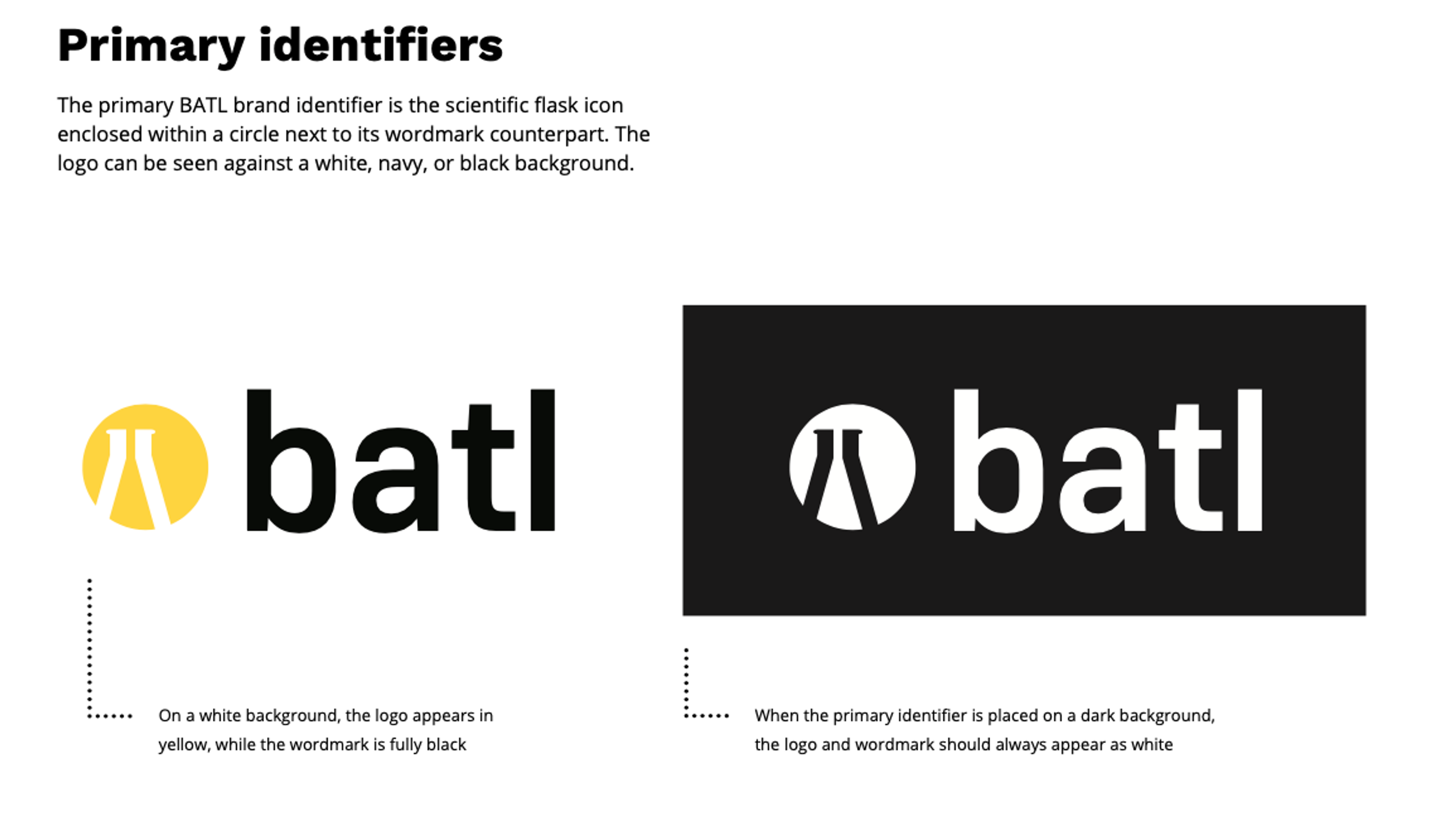
Keeping in mind BATL’s goals of being playful yet sophisticated, we wanted to create a logo that was minimal and sleek. Playing with negative space, we enforced BATL’s scientific focus within the primary icon including a flask.
Typography
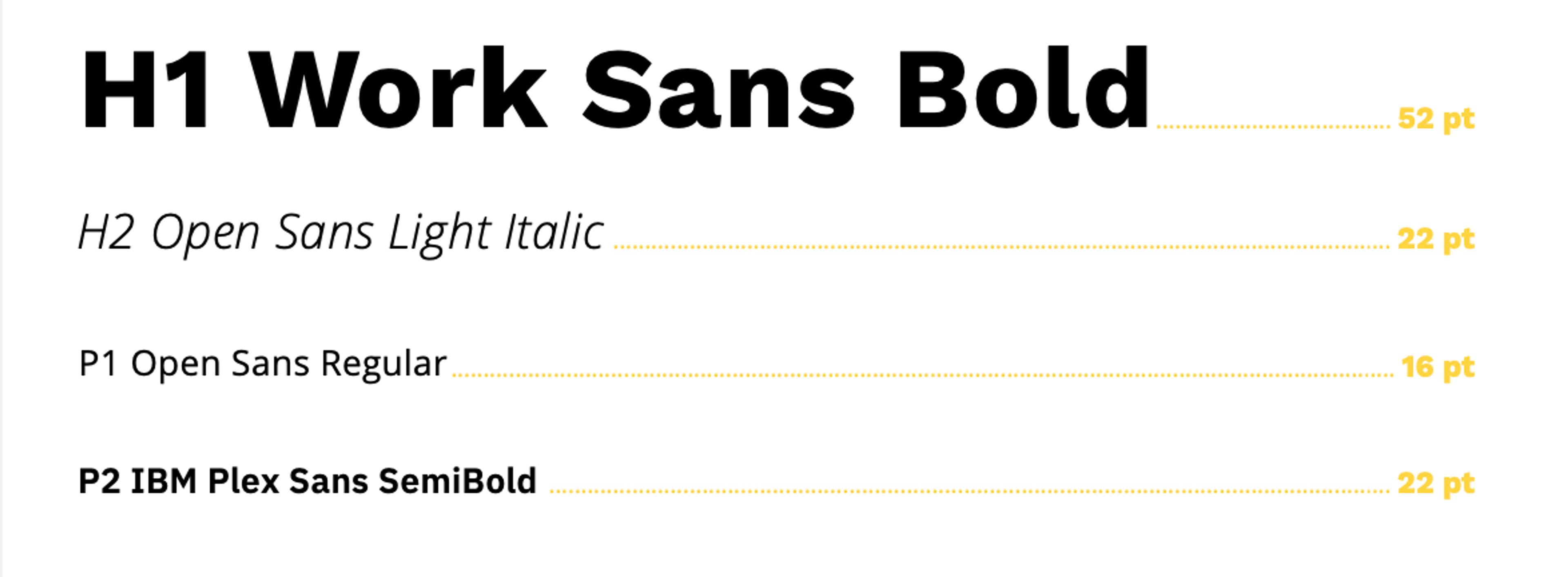
BATL’s typography included Work Sans, Open Sans, and IBM Plex Sans. These were chosen because of their simplicity and how they complement each other to create a unified look across that site. The bold headers in contrast to the italic subheading and simple body font create a striking balance while remaining informative and clear.
Color refinement
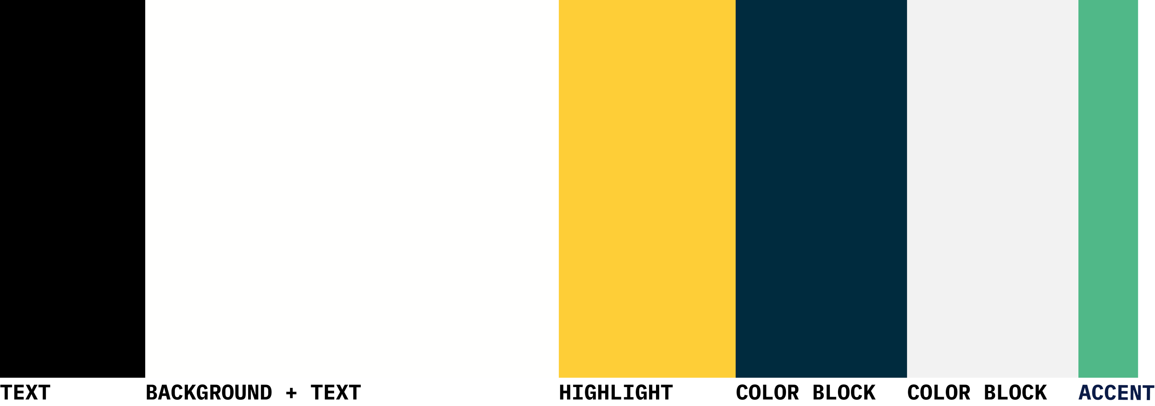
Throughout the client critique meetings, it was clear that our original palette leaned too heavily on the playful side, and we needed to tighten up the range. Removing the secondary colors, limiting the bold color usage, and focusing more on the cool tone, and simple shades, we ended up with a palette that was minimal with pops of vibrancy to convey a smart, yet approachable tone.
Working through designer / client disagreements
During this process, there was a moment when BATL wasn’t feeling confident in the primary color yellow, despite the past weeks of review and approval up to this point. It was an important moment for the team to take their message, reflect, and communicate the reasoning behind this color choice and the values it represented.
In theory, the design process works to eliminate the possibility of cold feet by working through iteration versions together and using brand exercises to back up intentional design choices. In practice, when there are cases where misalignment does arise, it’s important to not take it personally, reiterate the goals that brought the team here, communicate the technical reasons behind the design decisions, and come to consensus on a path forward.
Site development
We build the final version of the BATL site using React, Styled Component, and Contentful. The site is responsive to all screen sizes. As the lead developer, I wrote out extensive documentation for updating the site through Contentful, managing the Google Maps integration and general account information. At the end of the project, I sat down with the primary editor of the site to walk through updating and editing the content together.
Since Scout’s initial work on BATL, they have since been acquired by Northeastern’s College of Science and have updated their site accordingly.